Credit Card Processing Comparison Chart Problems
Anyone that's done research to find the best merchant account knows the charts that I'm referring to. They're laid out as neatly constructed tables listing the rates and fees offered by different merchant service providers. In many cases, the charts compare rates for tiered pricing models, but interchange plus charts can be just as misleading. There are two big problems with these charts that make them virtually useless. Firstly, they’re almost always provided by a company trying to get your business, so they’re extremely biased. To the processor, comparison charts are a sales tool, not an educational piece to help you. Secondly, you can't accurately compare merchant accounts from one provider to the next because pricing has no set terms to use as a basis for comparison. Without standardization, the charts are comparing apples and oranges.Comparison Charts Offer Biased Information
The first obstacle to a useful rate comparison chart is that they're often created and hosted by merchant account providers or their affiliates. Not surprisingly, the processor that hosts the chart always shows lower rates and fees than their competitors, but there’s no way to verify if that’s actually the rate you’ll pay. If you make a decision based on the rates in these charts, you could fall victim to credit card rate bait and switch tactics.Published Pricing Can Be Easily Manipulated
Merchant account fees are inconsistent by nature and can change frequently. In fact, rates can change as often as twice a year when Visa and MasterCard adjust their interchange fees. So the rates you see published in a comparison chart can quickly become out of date. On top of the frequency with which rates and fees change, the tremendous amount of competition in the payment card industry leaves pricing constantly in flux. Processors work to match or beat their competitors’ rates. This is especially true of providers who quote using tiered or bundled pricing, which can be easily manipulated by the provider. Processors aren’t required to use a particular pricing structure, which means there are no standards that can be used as a basis for an accurate comparison chart. To try to beat the competition, sales reps might waive fees, change contract terms, or lower equipment prices to entice you to sign up with them. Even when you’re reviewing rates from one processor it’s possible to get different quotes from different sales representatives working for the same company. What you see in a rate comparison chart might not be what you get, making it impossible to choose based on comparison chart rate information. Processors who offer to pay cash if they can't beat your current rates are a perfect example of how prices can be manipulated. They will always be able to "beat" your current rates by offering lower, but just because they've given you a lower rate doesn't mean you actually pay less. The processor can decide that almost none of your transactions "qualify" for the lowest rate. So even though your processor quotes one low rate, they can charge the majority of your credit card sales at a much higher rate. Related Article: The Truth Behind "$500 If We Can't Beat Your Rates" Offers.Processor-created and hosted charts aren't the only comparison charts out there, though. Independent review sites, business websites, and others may also post charts, attempting to help businesses compare solutions. As well-intentioned as these charts may be, they can still lead a business to the wrong conclusion. In the next section, we'll look at one such chart.
Best Credit Card Processing Chart
The screenshot below is a chart I came across on a business website in an article about finding the best credit card processing. As you can see, the chart lists 5 processors, specifying that each is best for a particular need: small business, high volume, low volume, mobile, and online.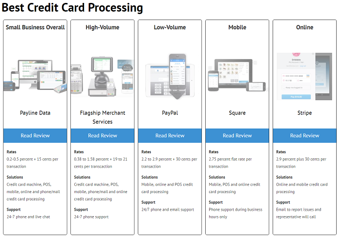 The approach is commendable. After all, what's best for an online business may not be what's best for a mobile business.
But what the chart doesn't mention is that the first two processors listed use a different pricing model than the last three. If you were to look at this chart with the goal of finding the lowest costs, you would see rates of 0.2 - 0.5% + 15 cents per transaction in the first box and rightfully conclude that that's lower than 2.9% + 30 cents per transaction in the last box. However, the chart fails to include the fact that the first box's listed "rates" don't include interchange - the biggest component of costs. The rate listed here is just one component - the processor's markup. A business choosing the first processor will pay much more than 0.2 - 0.5% and may feel duped.
For the "flat rate" style processing of the last two examples, the processor's markup is bundled into the 2.9% + 30 cent rate, meaning there is no way to know what the markup portion is. In order for this chart to be helpful, you'd need to be able to compare just that markup to the 0.2 - 0.5% + 15 cents per transaction from the first box.
It's important to understand not just "rates" but all the costs associated and the pricing model the processor uses.
Read more about Pricing Models.
The approach is commendable. After all, what's best for an online business may not be what's best for a mobile business.
But what the chart doesn't mention is that the first two processors listed use a different pricing model than the last three. If you were to look at this chart with the goal of finding the lowest costs, you would see rates of 0.2 - 0.5% + 15 cents per transaction in the first box and rightfully conclude that that's lower than 2.9% + 30 cents per transaction in the last box. However, the chart fails to include the fact that the first box's listed "rates" don't include interchange - the biggest component of costs. The rate listed here is just one component - the processor's markup. A business choosing the first processor will pay much more than 0.2 - 0.5% and may feel duped.
For the "flat rate" style processing of the last two examples, the processor's markup is bundled into the 2.9% + 30 cent rate, meaning there is no way to know what the markup portion is. In order for this chart to be helpful, you'd need to be able to compare just that markup to the 0.2 - 0.5% + 15 cents per transaction from the first box.
It's important to understand not just "rates" but all the costs associated and the pricing model the processor uses.
Read more about Pricing Models.
Business-Specific Variables
In addition to the different pricing models mixed together in this chart, businesses won't be able to take into account variables specific to their business. For example, while the chart states that the first processor is best for "small business overall" that won't be accurate for many small businesses, especially ones looking for the lowest cost. Many factors go into the cost to accept credit cards, including industry, average transaction size, monthly volume, and more. A business with an average transaction size under $10 will generally be better off going with a flat rate processor (one of the last three in the chart) rather than an interchange plus processor, meaning that coffee shops, food trucks, pizza parlors, and other quick-serve establishments could be easily misled by this chart, thinking that they should choose "best for small business overall" because they aren't looking for mobile, online, or low volume processing. However, doing so would likely result in higher costs than necessary. The reason a business with transactions under $10 would typically pay less with flat rate processing is due to the costs involved in processing small transactions. Credit card processors have to pay banks and the credit card companies for every transaction they process. Flat rate processors may actually lose money, which is what happened when Square processed cards for Starbucks. Static charts can't know how these factors will play into your business, and therefore can only provide very rough guidelines that can just as easily lead you to the wrong conclusion.For example...
As another example, an online business might think that they should go with the "best for online" processor, not taking into account how quickly a 30 cent per-transaction fee can add up. If the business processes a lot of transactions, it would make more sense to choose a processor with a lower per-transaction fee. In other words, if you have to pay 30 cents for each transaction, that will result in very different costs if you have one hundred $50 transactions or if you have ten $500 transactions. With one hundred transactions, you're paying $30 in just per-transaction fees. With 10 transactions, you're paying $3. It could be a good choice for the business with a few higher value transactions, but may not be for the business with lots of transactions. By contrast, the "best for small business overall" processor is shown offering 15 cents per transaction, or half of the amount of the "best online" processor. On one hundred transactions, you'd save $15 in transaction fees going with them instead of the "best for online" processor in the chart. Charts can't effectively communicate these business-specific variables, which can result in expensive mistakes by choosing the wrong processor. At this point, you may be thinking that there's no good or effective way to compare processors. It seems like every rule has a caveat and it's enough to make your head spin. Fortunately, there are easier and more reliable ways to compare processors to truly find the best credit card processing.How can I compare processors?
Rather than using a misleading or out-of-date comparison chart, the best solution for comparing processors is to obtain accurate pricing information that uses one pricing model (preferably interchange plus) and compare offers yourself. You'll need to be able to see the markup over cost, not just teaser "rates." You can obtain this information by calling processors to request quotes and attempting to get all the information and fees disclosed in writing, but it's easier to use a dynamic comparison tool like the one offered here at CardFellow. Our price comparison tool lets you put in your business transaction details so that you'll get accurate, personalized quotes instead of teaser rates or generic pricing. Give it a shot. You can sign up for free to get personalized quotes from multiple merchant account providers. All of the providers in CardFellow’s marketplace are required to offer quotes using interchange plus pricing structures, allowing us to ensure a standard for an apples-to-apples comparison that you can actually use. There's no obligation, and we never share your contact info. Whether you choose to do the research yourself or use an impartial website like CardFellow, don't be fooled by misleading, biased merchant account comparison charts floating around the internet. You're not looking for the best credit card processor by some arbitrary measure or limited to the processors the chart-maker decides you should consider. You're looking for the best credit card processing solution for you. Charts aimed at the general business world don't offer the level of advice and insight you need. Skip them and save yourself the hassle.
Ben Dwyer began his career in the processing industry in 2003 on the sales floor for a Connecticut‐based processor. As he learned more about the inner‐workings of the industry, rampant unethical practices, and lack of assistance available to businesses, he cut ties with his employer and started a blog where he could post accurate information about credit card processing. As the blog gained in popularity, Ben began directly assisting merchants in their search for a processor. Ben believes in empowering businesses by providing access to fair, competitive pricing, accurate information, and continued support. His dedication to transparency and education has made CardFellow a staunch small business advocate in the credit card processing industry.